A UX/UI case study focused on simplifying navigation and supporting confident purchasing decisions.
Project Overview
This project redesigns the
B-good online store to improve
usability, hierarchy, and
intuitive navigation.
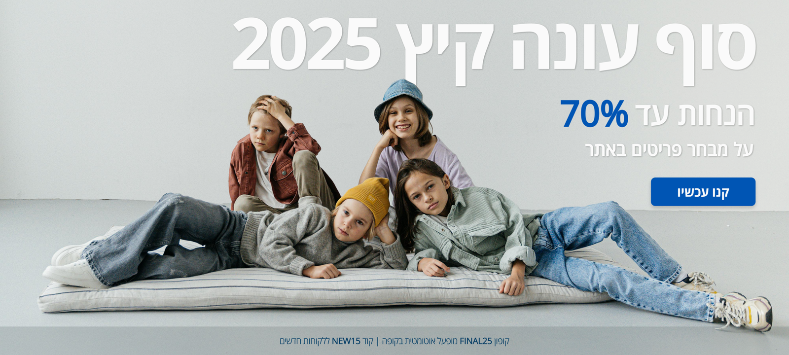
The goal was to support confident purchasing decisions for parents shopping for children’s clothing.
Problem Statement
The existing online store lacked clear hierarchy and consistent navigation, making it difficult for parents to browse products efficiently and make confident purchasing decisions.
Project Goals
Navigation & Structure
Improve navigation clarity and category structure
Confident Decisions
Support confident purchasing decisions for parents
Simplicity & Focus
Simplify product browsing and effortless exploration
Key Challenges
Unclear navigation and category structure
Difficulty comparing products and sizes
Lack of confidence during the purchasing process
Core User Insights
THINKS & FEELS
Seeks a clear, efficient shopping experience.
Concerned about choosing the right size.
Needs confidence in pricing value.
Feels overwhelmed by excessive options.
SAYS & DOES
Compares prices before purchasing.
Reviews size guides carefully.
Checks fabric and quality details.
Purchases when information is clear.
PAIN
Complex navigation slows decision-making.
Promotions lack visual clarity.
Unclear policies create hesitation.
Lengthy checkout reduces completion.
GAIN
Intuitive and focused navigation.
Transparent pricing and offers.
Direct access to size guidance
Streamlined and confident checkout.
Design Solutions
The design focused on simplifying navigation, improving hierarchy, and guiding users through a clearer and more intuitive purchasing flow.
Simplified navigation and clearer category structure to help users move easily between sections intuitively.
Clear product hierarchy and improved comparison flow enabling faster scanning and product evaluation.
A structured purchasing journey designed to reduce uncertainty and support confident decision-making.
Information Architecture
To improve clarity and navigation, the store’s information architecture was reorganized to support a simpler purchasing flow.
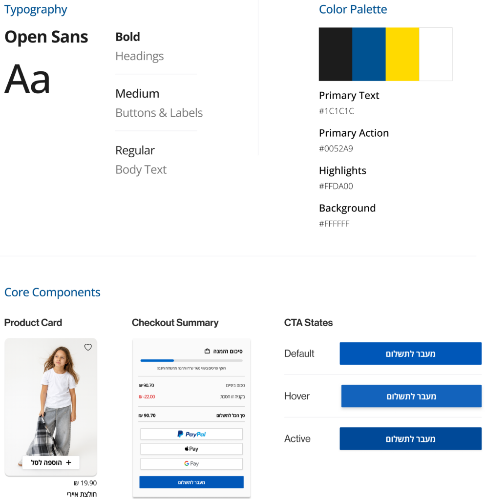
Visual System
A cohesive visual language designed to support a clear, accessible, and consistent shopping experience.
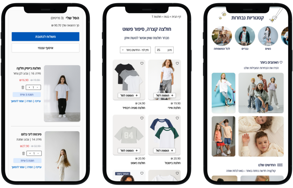
Mobile Experience Overview
An overview of the core mobile screens that support browsing, discovery, and purchase decisions.
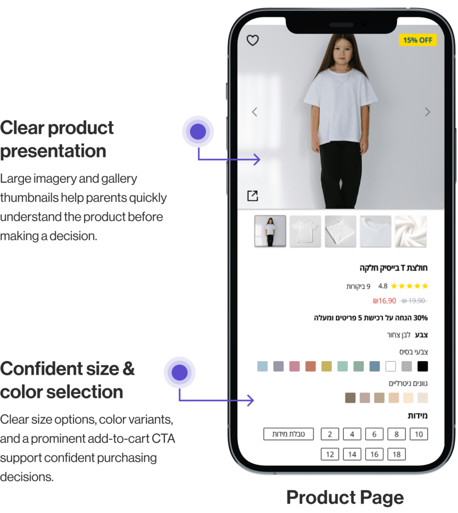
Key Screens
Selected key screens highlighting key UX decisions across the user journey.
Focused on the two most critical decision points during purchase journey.
Key UX Decisions
Focused design choices that simplify the mobile purchase flow.
Clear Flow
Guided path from browsing to checkout.
Confidence
Clear sizes, colors, and pricing.
Simple Checkout
Step-by-step process with minimal friction.
Mobile-First
Designed for mobile clarity and ease.
UX Impact
How the design decisions improved the purchasing experience.
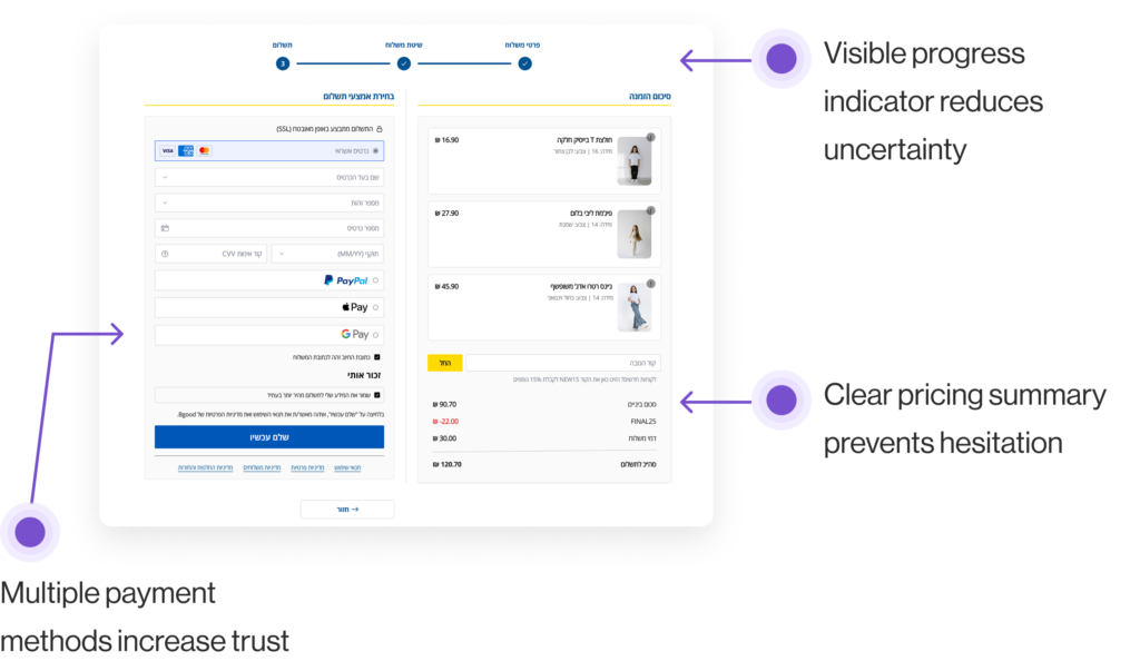
Clear Orientation
Users clearly understand their current step in the checkout process.
Reduced Hesitation
Structured product details and transparent pricing reduce hesitation.
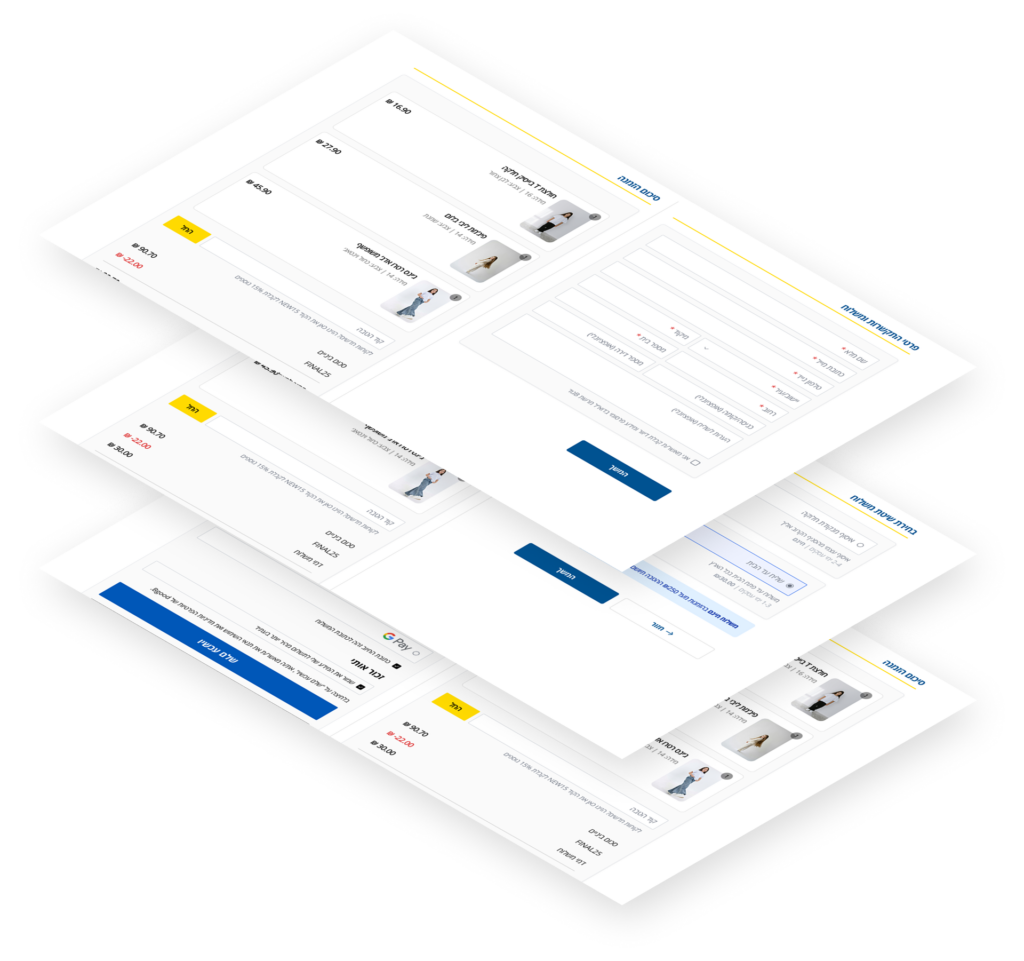
Faster Checkout
A streamlined checkout flow reduces friction and shortens completion time.
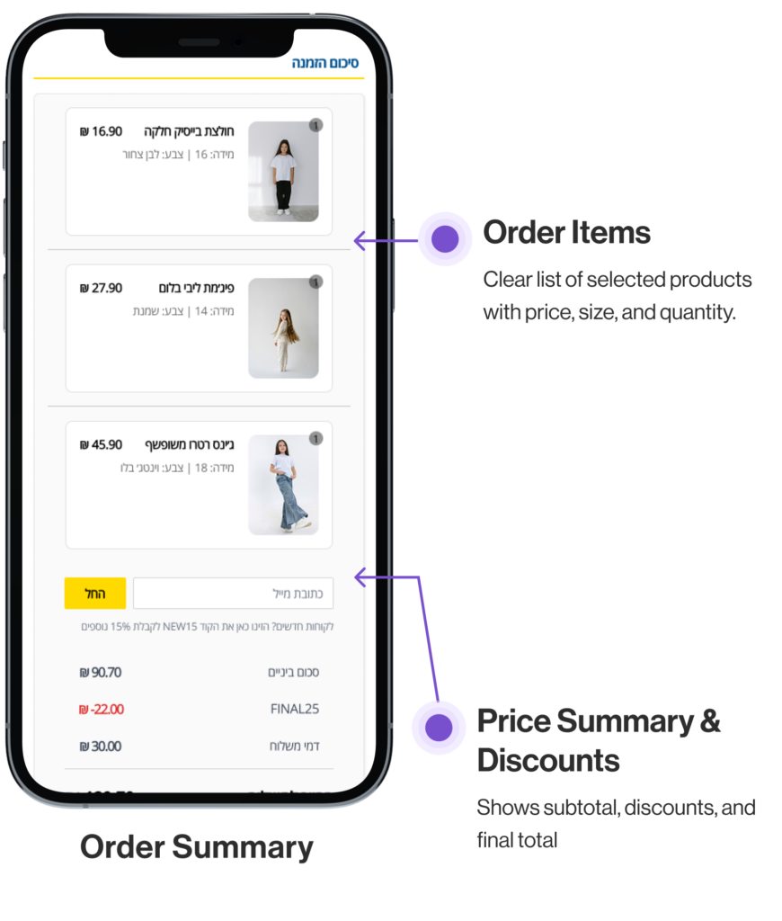
Checkout Optimization for Desktop
A clear step-based flow that reduces friction and builds purchase confidence.
Final UX Takeaways
Decision clarity reduces hesitation more than visual minimalism.
Transparent pricing is essential for building purchase trust.
Structured flows directly strengthen user confidence.