Learning Management Dashboard

AI-Assisted Dashboard Redesign

An AI-assisted dashboard redesign focused on improving information architecture, navigation, and access to essential academic resources.

 Overview

Timeline 3 Weeks

Tools Figma · Base44 · AI

Deliverables Desktop Dashboard

Focus Information Architecture · Navigation · Dashboard Design

Problem Statement

The existing learning portal presented information through a fragmented and outdated structure,
making it difficult for students to quickly access academic resources, schedules, and essential tools.

The redesign aimed to create a clearer, more intuitive experience through improved navigation and information hierarchy.

Current System Analysis

Key issues identified in the existing system.

Fragmented Navigation

Academic resources were scattered across sections.

Outdated Experience

The interface was not optimized for daily use.

Information Overload

Academic resources were scattered across sections.

Weak Hierarchy

Key actions and resources lacked clear visual priority.

Content Mapping

Content areas were grouped into clear categories to support a more organized dashboard structure.

Initial Wireframes

Early wireframes were created to explore layout structure, content placement, and navigation flow before moving into
AI-assisted prototyping.

Initial Design Decision

Dashboard-first layout
Categorized content areas
Simplified navigation
Modular content blocks
Prioritize academic resources
Clear information hierarchy

AI-Assisted Prototyping

A structured prompt was created based on the identified requirements, content hierarchy, and usability findings. It was then used in Base44 to generate an initial dashboard prototype for further refinement.

Prompt Inputs

RTL Interface Support
Hierarchical Navigation System
Academic Dashboard Structure
Key Student Information Cards
Weekly Schedule Visualization
Campus Content & Updates

AI Prototype Output

The generated prototype included key dashboard components, providing an initial structure for content organization, navigation, and user interaction.

Refined Dashboard Design

The initial prototype was refined to improve information hierarchy, navigation clarity, and access to key academic resources.

Key Improvements

01

Navigation

Content is organized into clear, intuitive groups.

02

Hierarchy

Important information is easier to find and understand.

03

Prioritization

Key tasks and updates are in one place for easy access.

04

Structure

Related resources are grouped logically for easier navigation.

Project Reflection

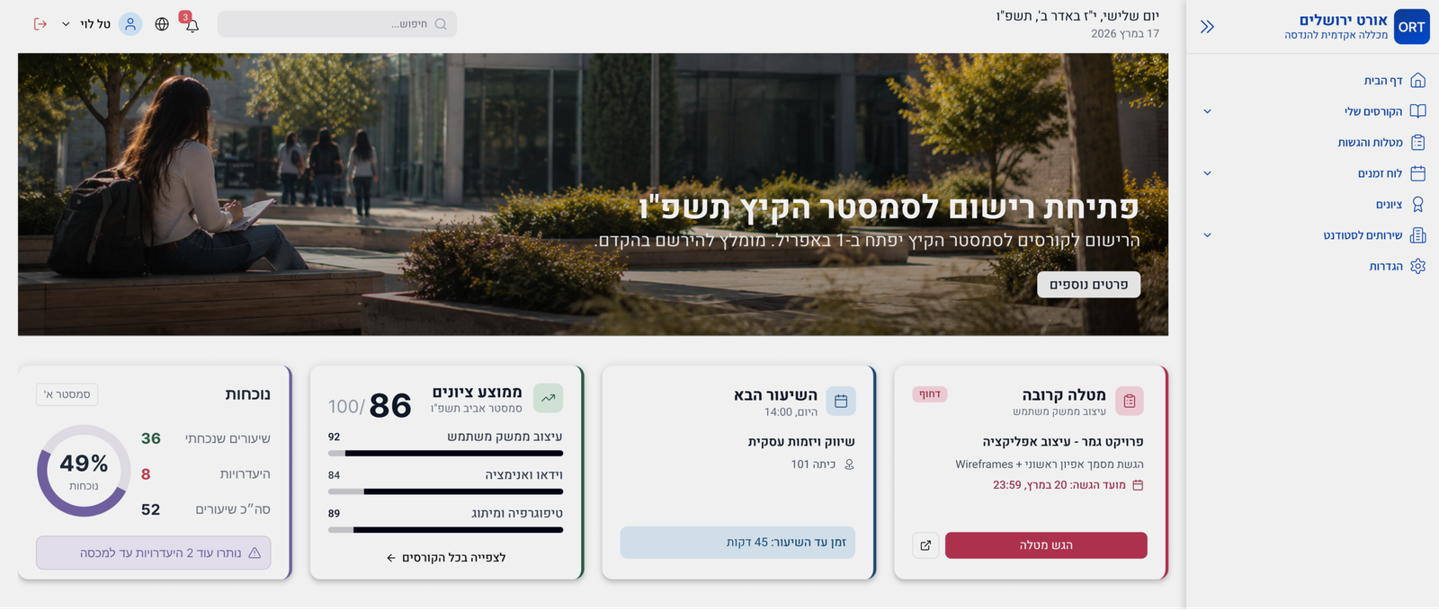
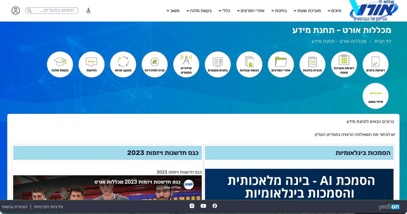
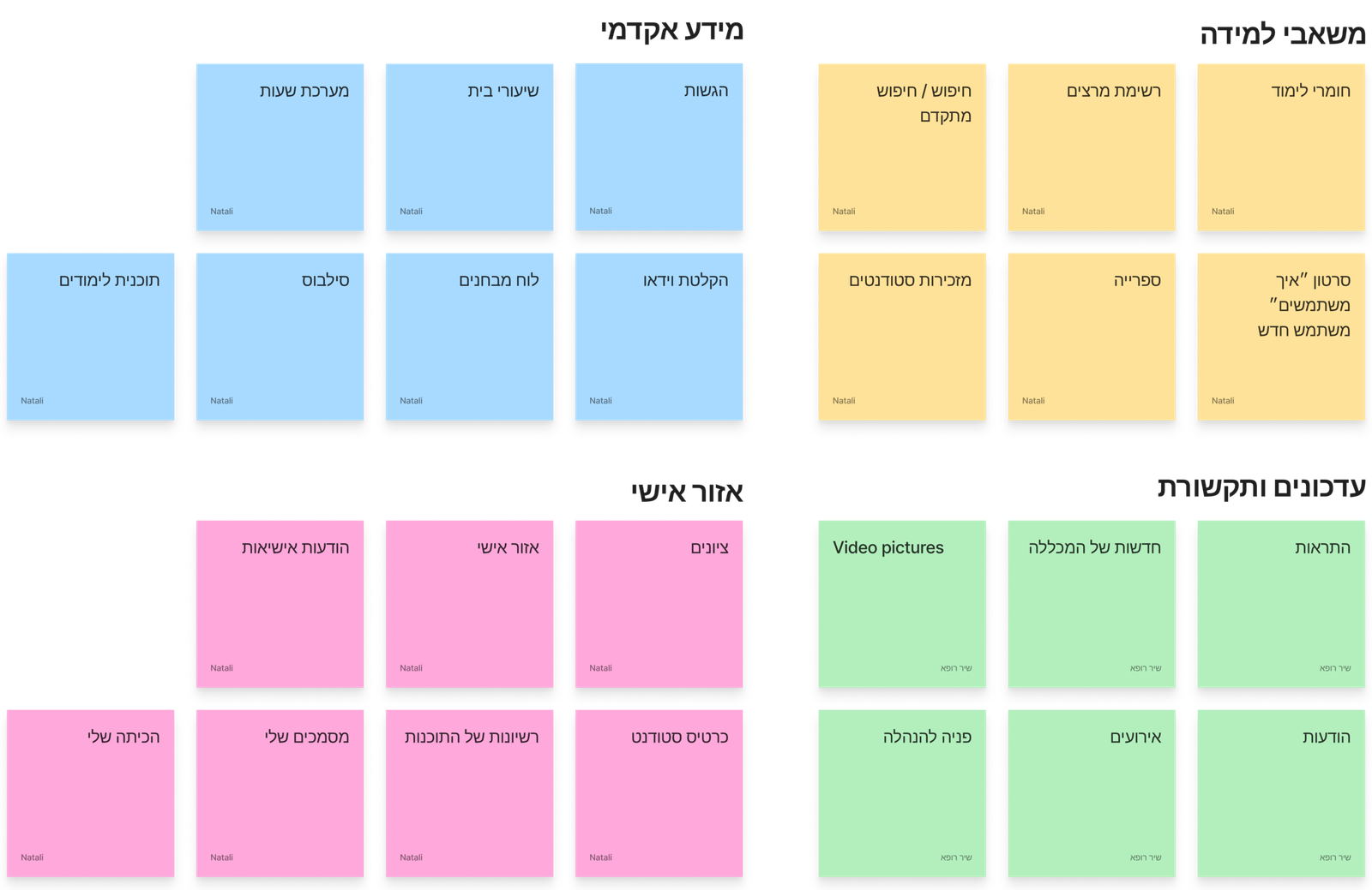
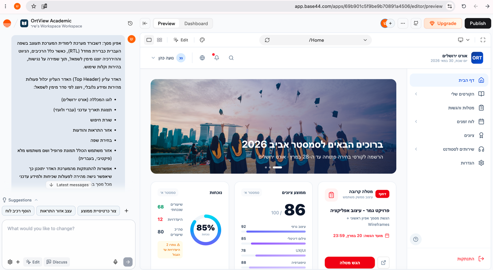
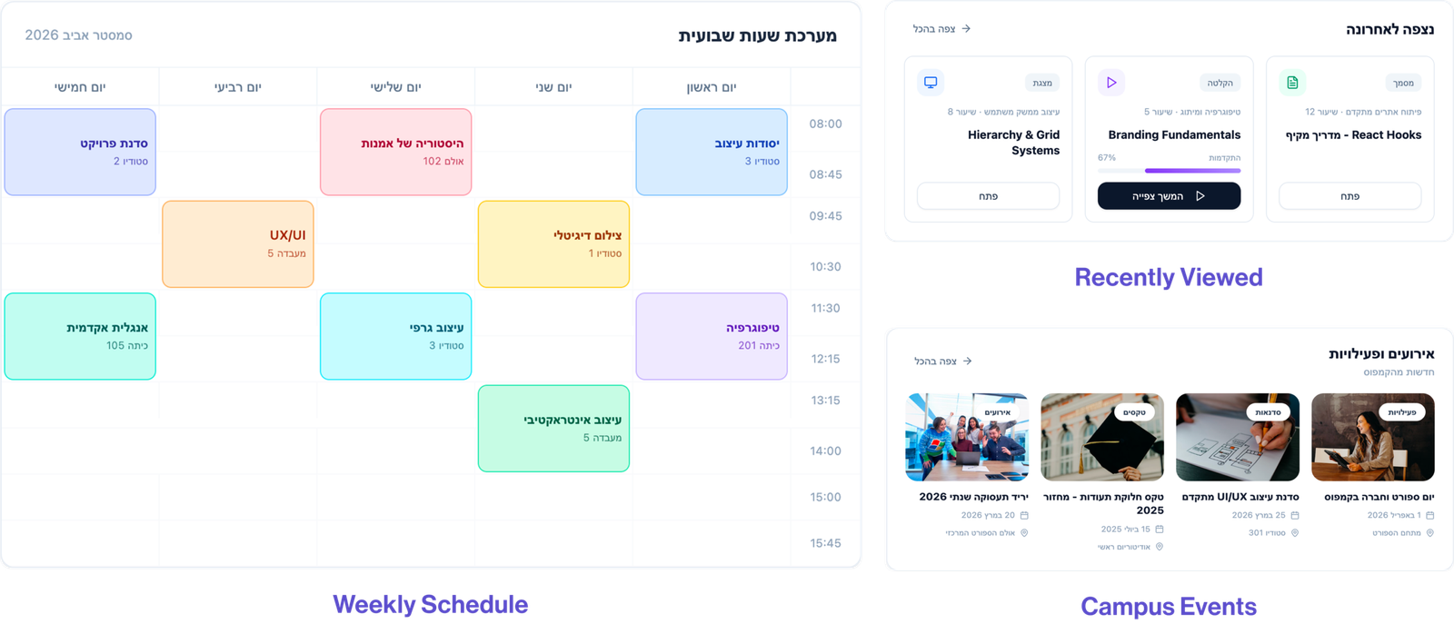
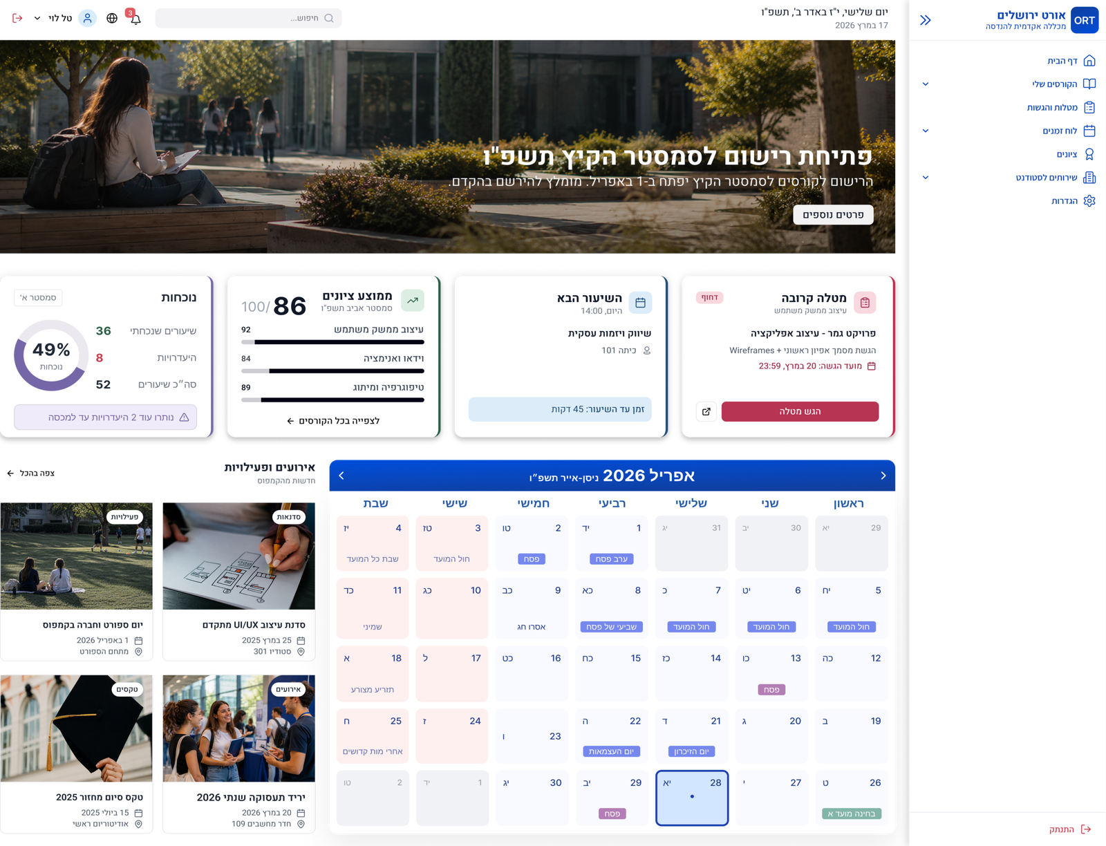
This project explored how AI-assisted tools can support the redesign of complex information systems. Through content analysis, information architecture, wireframing, and iterative prototyping, the platform evolved into a clearer and more user-friendly academic dashboard.

From fragmented information to a structured experience.